Pulse: A Population-Health Command Center Built with Shiny for Python and React
Pulse is a population-health command center: one web app where a health manager can see who is at risk, understand why, watch an intensive care unit in real time, test the value of an intervention before funding it, and check that the data behind every number can be trusted.
The app runs on a free server that sleeps when idle. If it takes about a minute to open, it is waking up; after that it is fast. All patient data in the app is synthetic.
Why I built it
Health data usually lives in separate places: a patient registry here, ward monitors there, budget spreadsheets somewhere else. Decisions get made on partial pictures, and data-quality problems quietly distort the numbers. Pulse brings these views together in one place and keeps every figure traceable back to the data.
It is also my first project with shinyreact, a new package from Posit that lets a Shiny for Python server do all the data work while a React front end handles the interface. Python does the analytics, and the browser gets a fast, modern, app-like experience.
1. Population: who is at risk?
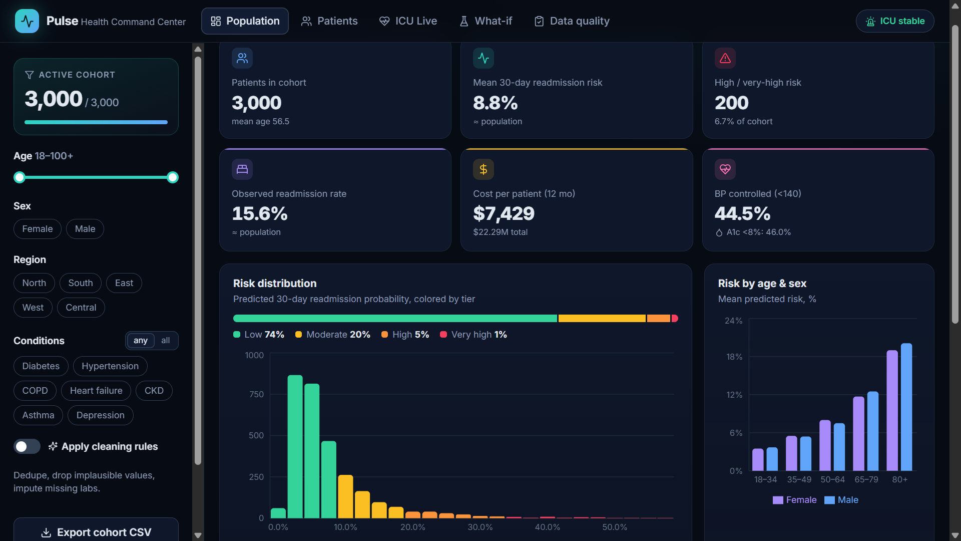
The Population view answers the first question any health manager asks: how is our population doing, and where is the risk concentrated?
- Cohort filters (left panel). Narrow the 3,000-patient registry by age range, sex, region and chronic conditions, matching any or all selected conditions. The "Active cohort" counter shows how many patients you are looking at, and Export cohort CSV downloads exactly that list.
- Headline indicators. Patients in the cohort, mean 30-day readmission risk, number of high and very-high-risk patients, observed readmission rate, cost per patient, and blood-pressure and HbA1c control. Each one is compared with the whole population, so a filtered group immediately shows whether it is better or worse than average.
- Risk distribution. Every patient's predicted readmission probability, colored by tier: Low, Moderate, High and Very high. In this population 74% are low risk, while a small tail of 6% drives a large share of expected readmissions.
- Risk by age and sex. Risk rises steeply after 65, which helps target where prevention programs should go first.
Further down the page, a comorbidity map shows which conditions occur together more often than chance, and a regional view compares cost and risk across regions.
2. Patients: why is this person at risk?
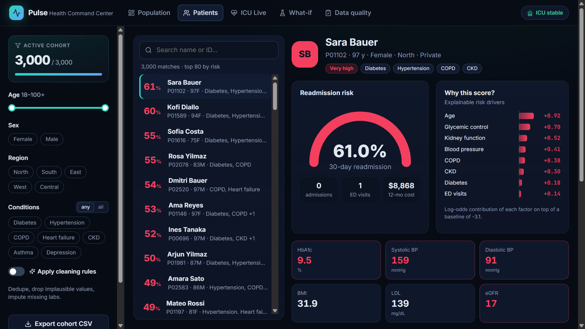
A risk score is only useful if a clinician can trust it. The Patients view opens an individual chart and explains the number.
- Risk-ranked list. Patients are sorted from highest to lowest risk, with search by name or ID.
- Readmission gauge. The patient's predicted 30-day readmission risk, with admissions, emergency visits and 12-month cost underneath.
- "Why this score?" The model is deliberately transparent: each factor (age, glycemic control, kidney function, blood pressure, COPD and so on) shows exactly how much it adds to the risk. For this patient, age, poor glucose control and reduced kidney function are the biggest drivers, which points directly at what care can change.
- Vitals and labs. Values outside safe ranges (HbA1c 9.5%, blood pressure 159/91, eGFR 17) are highlighted in red. Missing results are labelled clearly rather than hidden.
Below these, a 24-month trend of HbA1c and blood pressure and a timeline of admissions, emergency visits and medication changes complete the picture.
3. ICU Live: real-time early warning
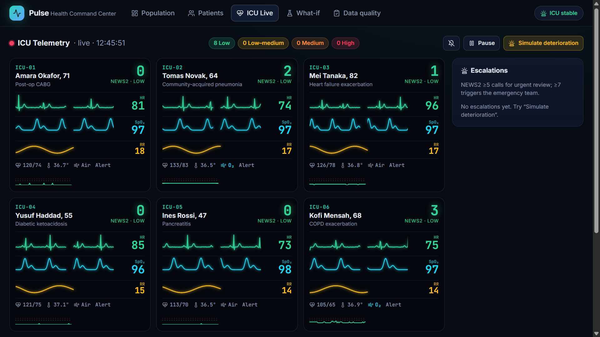
The ICU Live view simulates a ward monitor for eight intensive-care beds. The server sends new vital signs every second, and the screen draws bedside-style waveforms: heart rhythm (ECG) in green, blood oxygen (pleth) in blue and breathing in yellow.
- NEWS2 early-warning score. Each bed is scored with NEWS2 (National Early Warning Score 2), the standard used in UK hospitals, combining breathing rate, oxygen saturation, supplemental oxygen, blood pressure, pulse, consciousness and temperature. The summary pills show how many beds are at Low, Low-medium, Medium and High risk.
- Escalations. When a patient crosses NEWS2 5 (urgent review) or 7 (emergency response), an alert is logged on the right, an optional alarm sounds, and a notification appears on every page of the app, so nobody misses a deteriorating patient while looking at something else.
- Try it yourself. Click Simulate deterioration and watch a stable patient slide toward septic shock: heart rate climbs, oxygen and blood pressure fall, and the score rises. Click Sepsis bundle on that bed to start treatment and watch the vitals recover.
4. What-if: is an intervention worth funding?
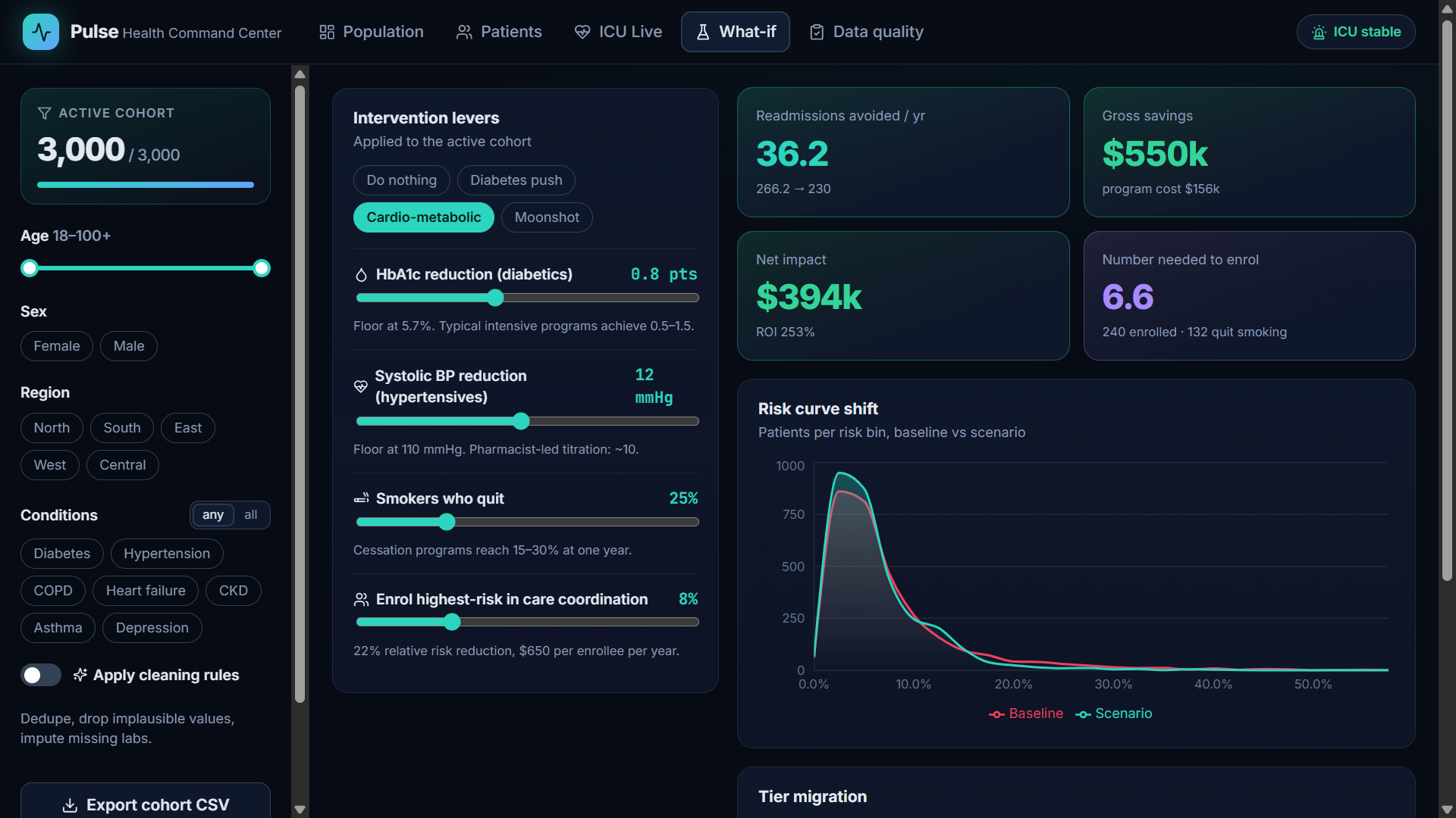
Before a program is funded, managers need to know what it is likely to achieve. The What-if simulator turns that into numbers.
- Intervention levers. Lower HbA1c for people with diabetes, lower blood pressure for people with hypertension, help smokers quit, and enrol the highest-risk patients in care coordination. Ready-made presets (Do nothing, Diabetes push, Cardio-metabolic, Moonshot) make comparison quick.
- Impact. Readmissions avoided per year, gross savings, net impact after program cost, return on investment, and the number needed to enrol to prevent one readmission. In the scenario shown, 36 readmissions are avoided, saving $550k against a $156k program cost, an ROI of 253%.
- Risk curve shift. The red baseline and teal scenario curves show how the intervention moves patients out of the high-risk tail.
5. Data quality: can we trust the numbers?
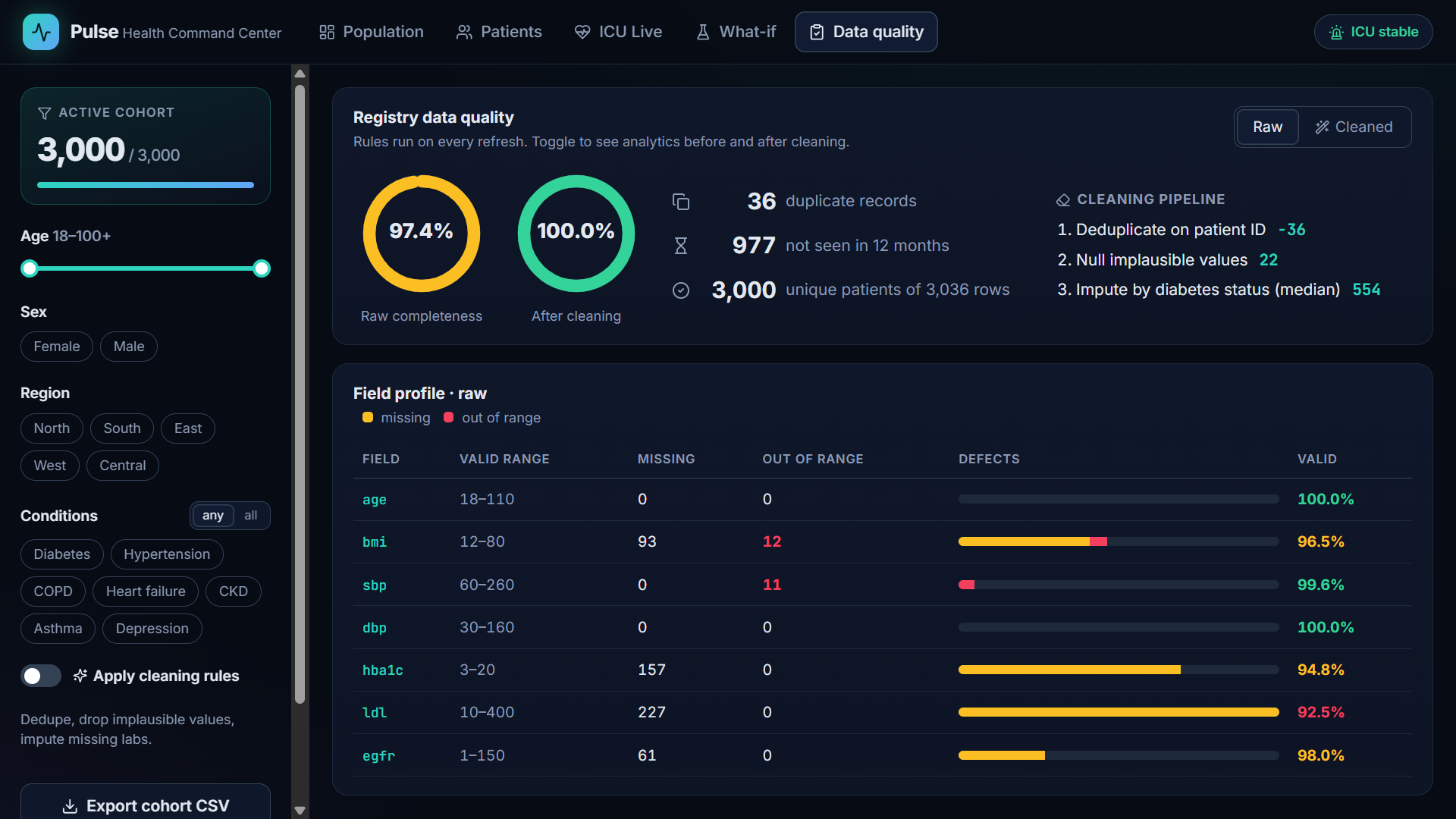
Every real registry has errors, and dashboards are only as good as the data behind them. The Data quality view makes those problems visible and fixable.
- Completeness rings. The raw registry is 97.4% complete; after the cleaning rules it reaches 100%.
- Record checks. 36 duplicate records, 977 patients not seen in 12 months, and 3,000 unique patients among 3,036 rows.
- Cleaning pipeline. Three transparent steps: remove duplicates by patient ID, blank out impossible values (for example a blood pressure keyed twice, or a BMI with a misplaced decimal), and fill missing lab values using medians within diabetes status.
- Field profile. For each measurement: its valid range, how many values are missing or out of range, and the share that is valid.
- Before and after. Switch Apply cleaning rules on and every chart in the app recalculates on the cleaned data, so you can see exactly how much the errors were distorting the picture.
How it is built
- Python server (Shiny for Python): generates the synthetic registry, runs the risk model, cohort analytics, NEWS2 scoring, simulator and data-quality rules with pandas and NumPy, and sends results to the browser as JSON.
- React front end (shinyreact): the whole interface is a React app written in TypeScript, with charts from Recharts, connected to the server through shinyreact's hooks. Live ICU data is pushed from the server every second.
- Tested: automated tests cover the analytics and the server's reactive logic.
- Deployed: code on GitHub, automatically deployed to Render on every update.
Note: all patients, wards and figures in Pulse are synthetic, generated for demonstration. The risk model is illustrative and not validated for clinical use.
Try it
Open the app, filter the population, open a high-risk patient's chart, then switch to ICU Live and click Simulate deterioration. I would love to hear what you think, and what you would add for your own health program.
The app runs on a free server that sleeps when idle. If it takes about a minute to open, it is waking up; after that it is fast. All patient data in the app is synthetic.