From Dashboards to Risk Prediction: DHIS2 Interoperability with Power BI and Shiny for Python
Every month, health facilities report antenatal visits, vaccine doses and service data into DHIS2. That routine data is one of the most valuable assets a health system has, but only if it reaches the people who plan services in a form they can act on. This is the story of two applications built on the same DHIS2 source: a Power BI dashboard that shows what has happened, and a Shiny for Python application that adds a first look at where problems may arise next.
For education and demonstration only, with DHIS2 demo data. See the disclaimer at the end.
Why routine data needs to become insight
DHIS2 is used by ministries of health in many countries, and it is excellent at collecting and aggregating data. But a district health team preparing a supervision plan does not need a data export; it needs answers. Which chiefdoms are furthest from their immunisation target? Where do women start antenatal care but not finish it? Which reports are missing? And, increasingly: which facilities are likely to struggle next quarter, so that support arrives before the gap widens?
Answering those questions means moving data out of DHIS2 and into tools built for analysis. That is what interoperability means in practice: DHIS2 exposes its data through a documented Web API, and other tools can read it reliably, securely and repeatably. This project uses that API twice.
The first milestone: DHIS2 and Power BI
A few months ago I connected DHIS2 to Microsoft Power BI, using the public DHIS2 demo playground (Sierra Leone demo database). Power Query calls the DHIS2 Web API directly: one function sends each request with its authorisation header, and another turns the api/analytics response into a table of indicator values by chiefdom and month. Server address, organisation unit and period are report parameters, so the same file can point at another DHIS2 instance. No export files, no copy-and-paste: a refresh pulls the latest data.
The semantic model then does what a programme analyst would do by hand. Coverage is computed from numerators and annualised populations, the same way DHIS2 does it, so figures stay correct when districts or months are combined. Dropout, reporting rates, colour shading against targets, and even written findings and recommended actions are DAX measures that update with every filter.
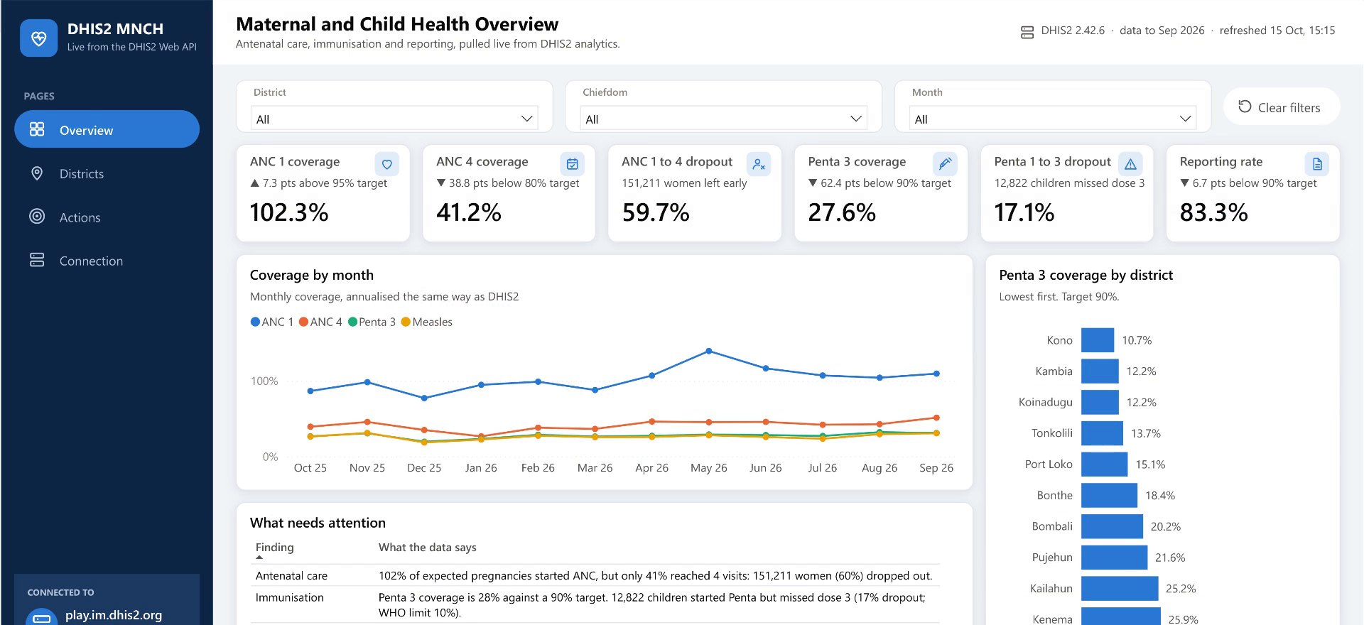
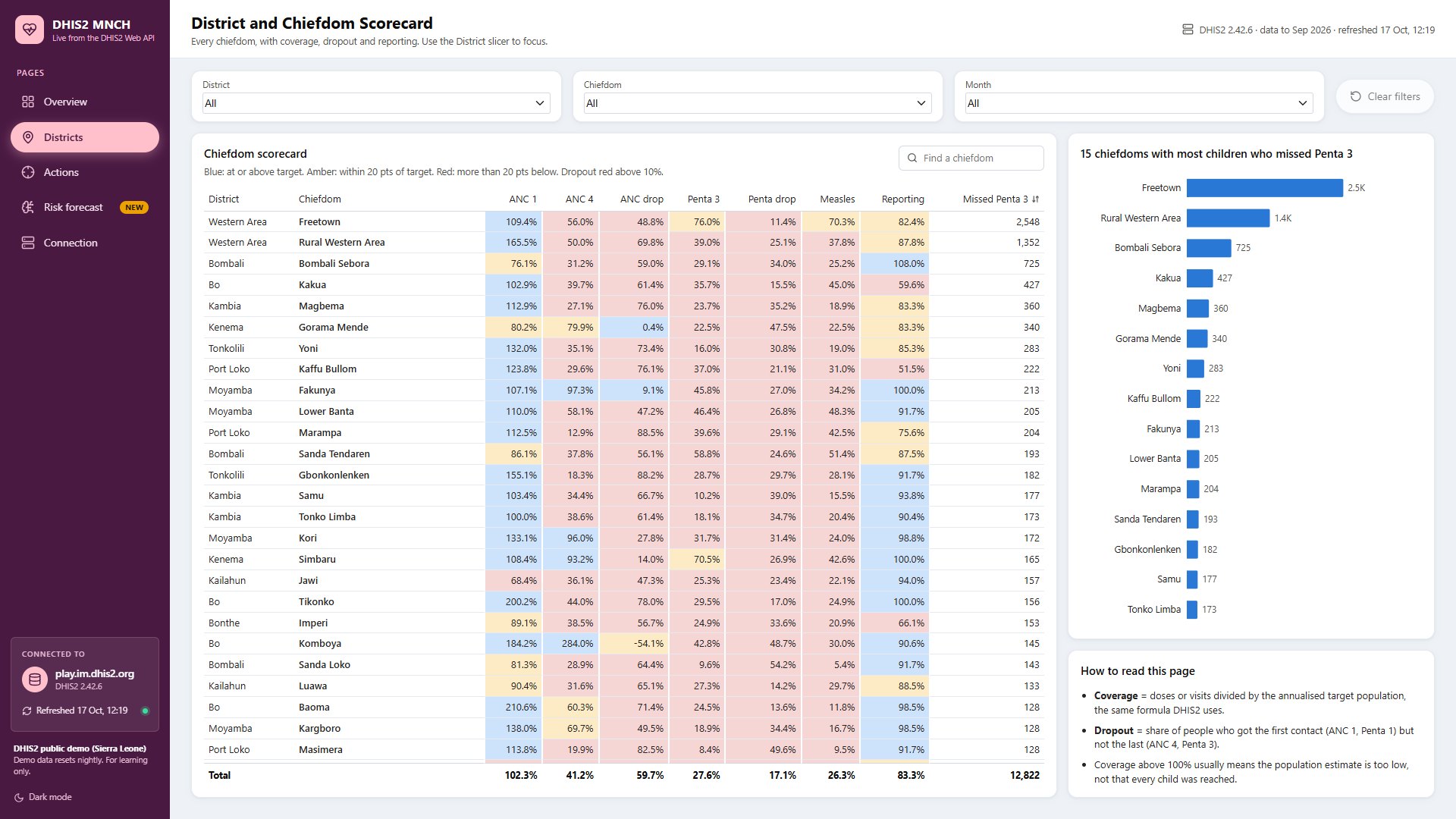
For the twelve months to Sep 2026, the dashboard shows 102.3% ANC 1 coverage but only 41.2% ANC 4 coverage: 151,211 women (59.7%) started antenatal care and did not reach four visits. Penta 3 coverage is 27.6% against a 90% target, and 12,822 children received Penta 1 but not Penta 3 (17.1% dropout, above the 10% limit WHO uses to flag a problem).
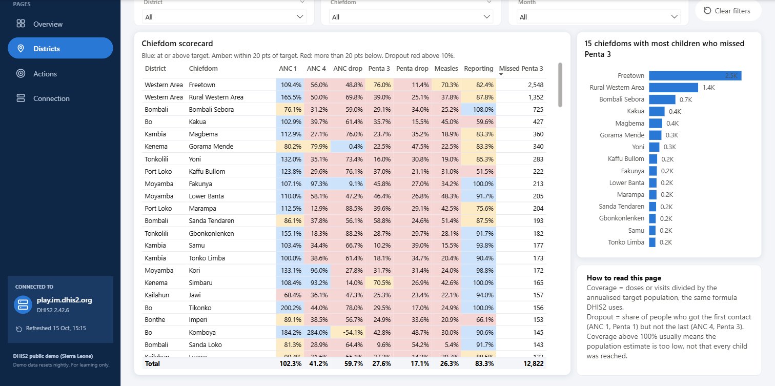
The Districts page turns this into a list of places, and the Actions page into next steps: where to trace defaulters first, which districts report below target, and which chiefdoms show coverage above 100%, a sign that the population estimate needs checking before anyone uses the number.
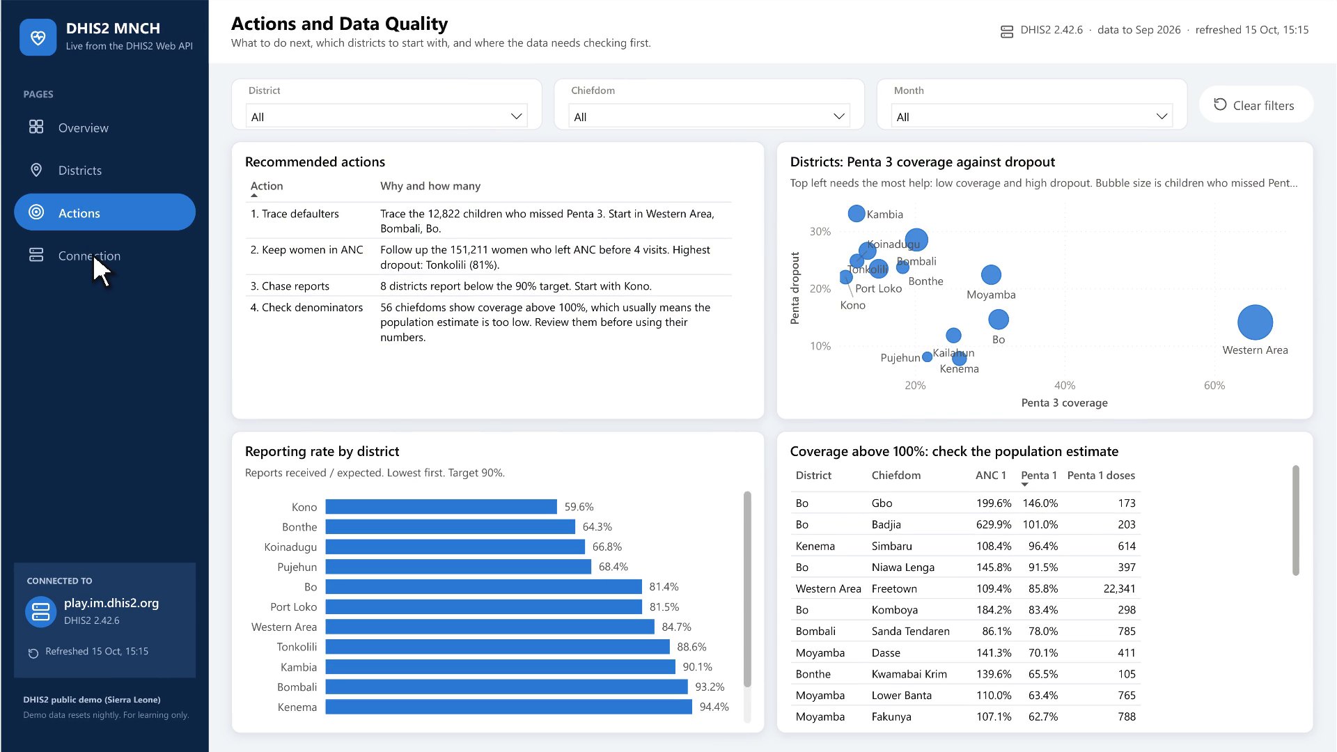
This is descriptive analytics: an accurate, shared picture of performance that stakeholders can filter, discuss and act on.
The next milestone: Shiny for Python
Power BI answers the descriptive question well. But two things pushed me further. First, the analysis I wanted next, a statistical model at facility level, belongs in a programming language. Second, I wanted to see whether an open-source stack could deliver the same dashboard experience, so that teams without Power BI licences, or who want to customise every detail, have an option.
So I rebuilt the dashboard with Shiny for Python and a React interface (through the shinyreact package). A small Python client sends the same requests to the DHIS2 Web API as Power Query does, and a Python module re-implements each DAX measure. Automated tests confirm that the two applications agree, figure for figure: 102.3%, 41.2%, 59.7%, 27.6%, 17.1% and 83.3% on the headline cards, down to the scorecard's Total row.
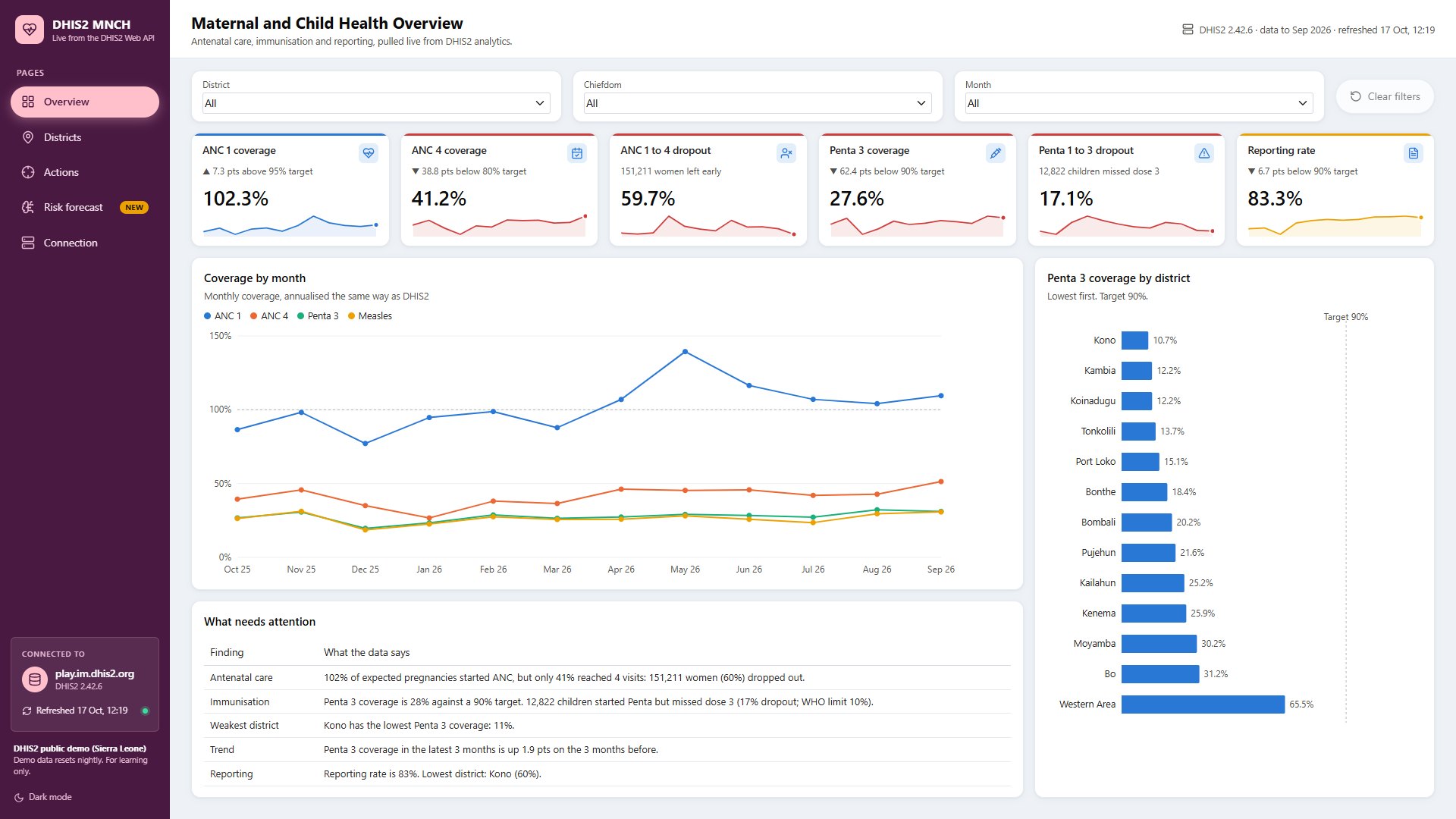
The Shiny version also pulls the same indicators for each of the 1,166 health facilities in the demo database, not just the 152 chiefdoms. That facility-level data is what makes the next step possible.
Introducing predictive analytics
The new Risk forecast page asks a forward-looking question for every facility: how likely is it that next quarter this facility will fall behind? "Falling behind" is defined with the dashboard's own thresholds, for two outcomes:
| Outcome | Definition (next 3 months) | Facilities scored |
|---|---|---|
| Low vaccination coverage | Penta 3 coverage below 70%: more than 20 points under the 90% target, the scorecard's red band | 226 |
| ANC dropout | More than 50% of women who start antenatal care (ANC 1) do not reach a fourth visit (ANC 4) | 990 |
Only facilities that report Penta doses can be scored for coverage (226 of them), and only facilities with at least 10 ANC 1 visits in the last quarter for dropout (990).
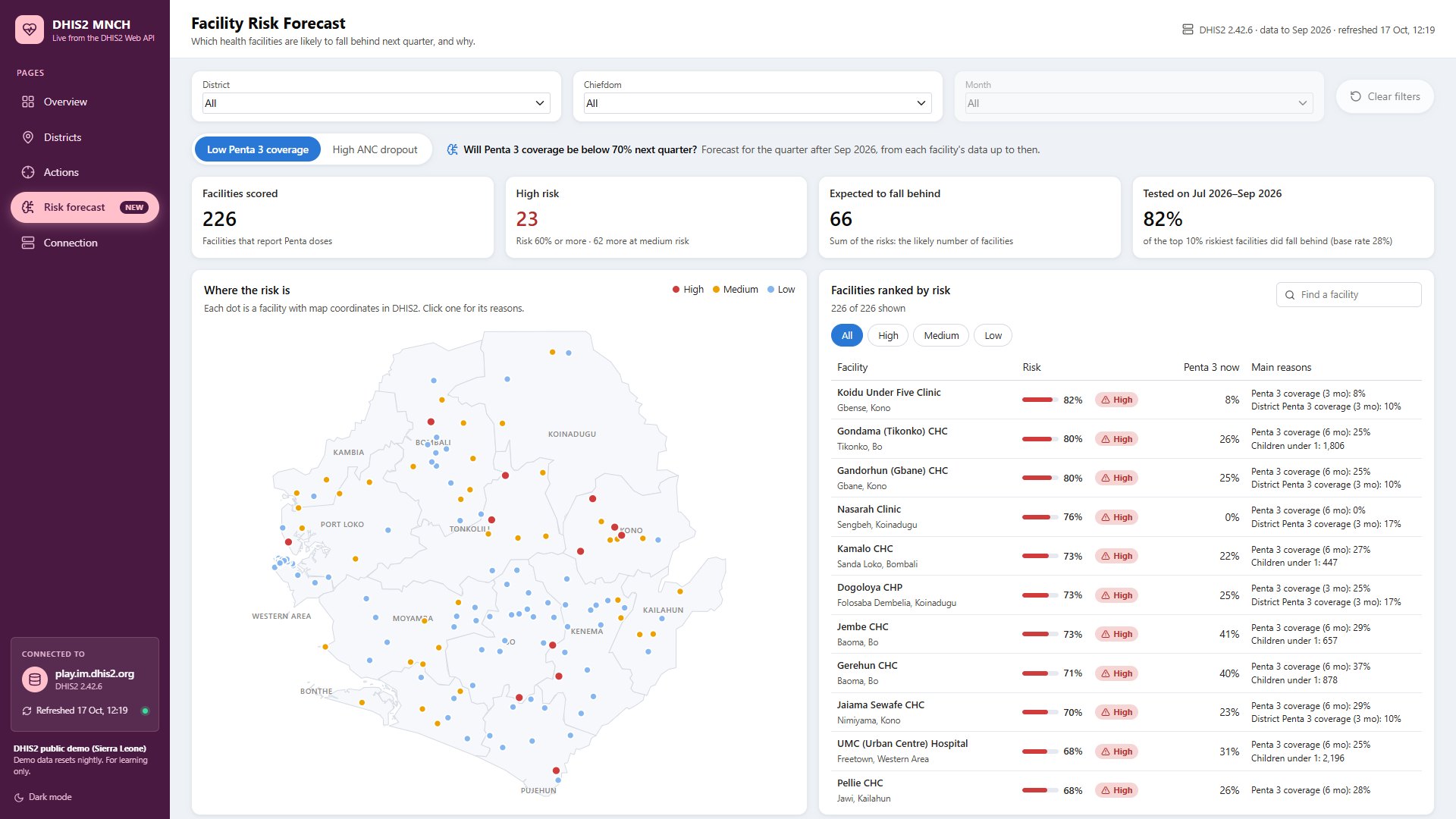
The model is a logistic regression, a well-understood statistical method that estimates the probability of a yes-or-no outcome. Its inputs are each facility's recent DHIS2 history: coverage or dropout over the last three and six months, reporting completeness, the size of the population served, and the level in its district. The output is a risk between 0% and 100%, shown in three bands: high (60% or more), medium (35 to 60%) and low. Because the model is a weighted sum of named factors, every estimate can be explained: the app lists the factors that raise each facility's risk the most.
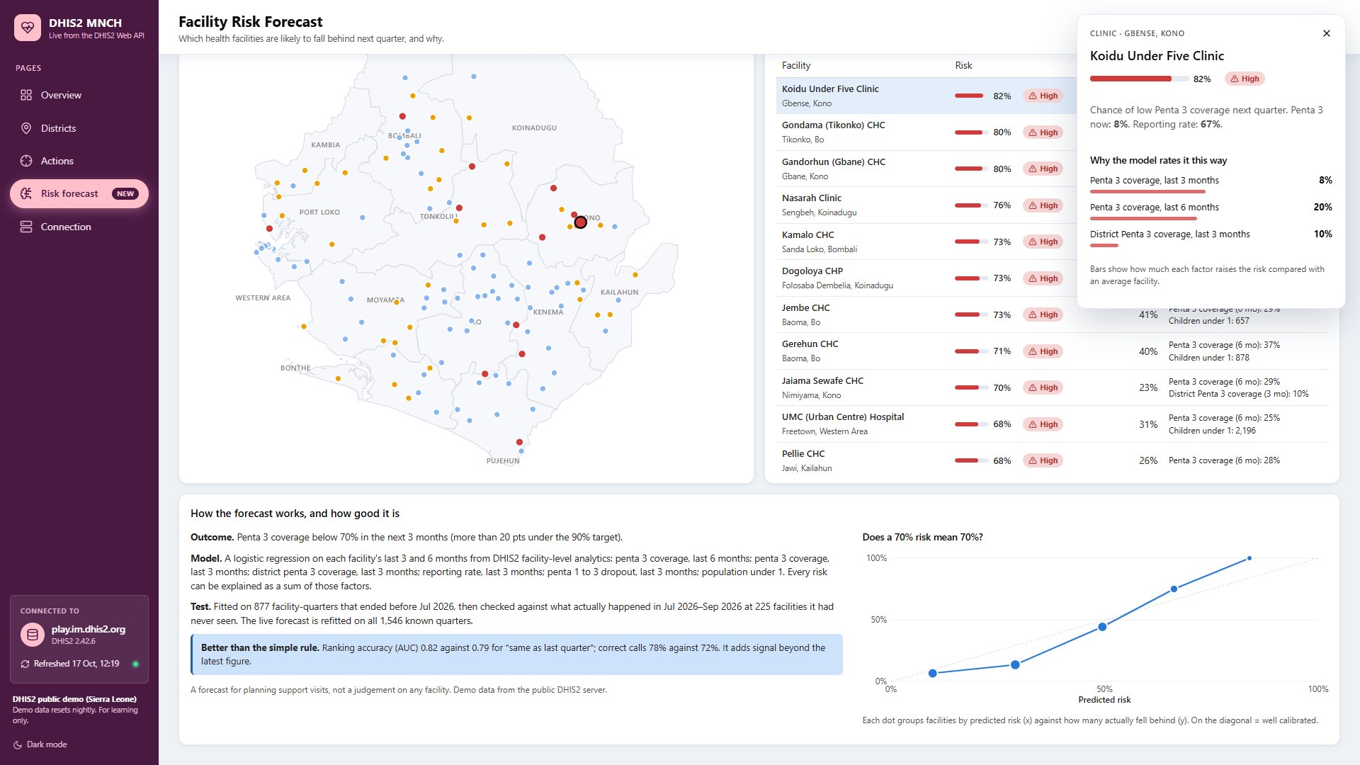
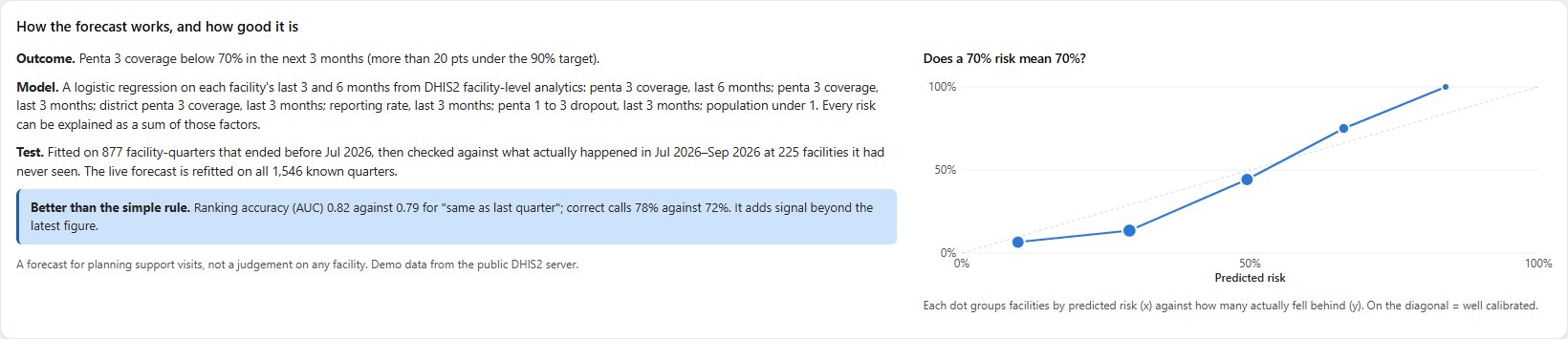
Is it any good? A model is only useful if it is tested honestly. I trained it on quarters that ended before Jul 2026, then checked its estimates against what actually happened in Jul 2026 to Sep 2026 at facilities it had not seen in that period. I compared it with the simplest possible rule, "same as last quarter":
| Test quarter: Jul 2026 to Sep 2026 | Low Penta 3 coverage | High ANC dropout |
|---|---|---|
| Facilities tested | 225 | 971 |
| How many actually fell behind (base rate) | 28% | 64% |
| Ranking accuracy (AUC), model | 0.82 | 0.85 |
| Ranking accuracy (AUC), "same as last quarter" | 0.79 | 0.86 |
| Correct calls, model vs simple rule | 78% vs 72% | 76% vs 79% |
| Of the 10% rated riskiest, how many did fall behind | 18 of 22 | 94 of 97 |
For vaccination coverage, the model ranks facilities better than the simple rule. For ANC dropout it does about as well, not better: a facility's recent dropout already carries most of the signal, and the model's contribution there is a probability and an explanation rather than better ranking. The app states this on the page, and shows a calibration chart so users can see whether "70% risk" really means about 70%. AUC (area under the curve) is the chance that a facility which did fall behind was rated riskier than one that did not: 0.5 is guessing, 1.0 is perfect.
Using the latest data (Jul 2026 to Sep 2026), the app estimates risk for the following quarter. For coverage, 23 facilities have a high estimated risk; summed, the probabilities suggest that about 66 of the 226 facilities may fall below 70%. These are estimates, a prompt to look more closely, not findings.
System architecture and workflow
Both applications use the same DHIS2 endpoints and the same indicator catalogue: ANC 1 and ANC 4 visits, BCG, Penta 1, Penta 3 and measles doses, and two reporting rates, with expected pregnancies and the population under one year as denominators. Credentials stay on the server side: report parameters in Power BI, environment variables in the Shiny app, never in the browser. The Shiny app starts instantly from a saved snapshot, pulls live data in the background, and refreshes on demand.
Comparing the two approaches
| DHIS2 + Power BI | DHIS2 + Shiny for Python + risk model | |
|---|---|---|
| Purpose | Understand performance: what has happened, and where | Everything on the left, plus: where might problems arise next? |
| Data | DHIS2 analytics by chiefdom and month | The same, plus every health facility |
| Analytics | Descriptive: coverage, dropout, reporting, targets, rule-based findings | Descriptive (identical figures) and predictive: logistic regression per facility |
| Outputs | KPI cards, trends, scorecards, recommended actions, data-quality flags | The same, plus risk probabilities, risk bands, reasons, a map and a model card |
| Strengths | Fast to build, familiar to many organisations, strong sharing and governance in the Power BI service | Open source, fully customisable, the model and the dashboard in one place, testable code |
| Use cases | Monthly reviews, performance reporting, district and partner meetings | Planning supportive supervision, prioritising follow-up visits, exploring early warning |
The two are not competitors. Power BI gives stakeholders a trusted picture of what has happened. Shiny for Python shows how the same data, once it flows freely from DHIS2, can also support questions about the future. Together they show the point of interoperability: one source of truth, and the right tool for each question.
What this could mean for public health decisions
Used responsibly, tools like these can help health teams to:
- Monitor coverage, dropout and reporting against targets every month, without manual exports.
- Spot service-delivery gaps early, such as women leaving antenatal care or children missing their third Penta dose, and see where they are concentrated.
- Prioritise follow-up: a ranked list of facilities with a high estimated risk, and the reasons, is a starting point for supportive supervision or data verification.
- Plan and allocate resources, for example outreach sessions or vaccine stock, informed by both current performance and likely trends.
Throughout, it matters to keep three kinds of information apart, and the application does so:
Observedwhat DHIS2 data show, such as Penta 3 coverage of 27.6%.
Estimatedwhat the model suggests, such as an estimated risk of 82% that Koidu Under Five Clinic's Penta 3 coverage falls below 70% next quarter.
Follow-upwhat people may decide to do, such as checking the facility's data and visiting it. The tools inform this step; they do not take it.
Lessons learned and what comes next
- Data quality comes first. Some demo chiefdoms show ANC 1 coverage above 600%, a sign of population estimates that are far too low. The ANC model even learned to treat coverage above 100% as a risk signal, because those facilities had higher dropout in the past: a data artefact, not a cause. Real deployments should fix denominators before modelling.
- Validate honestly, against a simple baseline. Splitting data by time, never at random, and comparing with "same as last quarter" showed where the model adds value (coverage) and where it does not (ANC dropout). A single test quarter is a demonstration, not a validation study.
- Simple, explainable models first. Logistic regression is transparent: every estimate breaks down into named factors. With one year of data, more complex models would be hard to justify.
- Interoperability is a design choice. Keeping the same API requests, indicator catalogue and formulas in both tools made it possible to test that they agree, and builds trust in both.
- Next steps: more years of real data and several test periods, monitoring of model accuracy over time, more indicators (measles dropout, facility delivery), DHIS2 personal access tokens instead of passwords, and co-design with programme staff on how risk estimates should be presented and used.
Watch both tours
Conclusion
Routine health data becomes valuable when it reaches decision-makers as clear, trustworthy insight. Connecting DHIS2 to Power BI showed what has happened, across districts and chiefdoms. Rebuilding the dashboard in Shiny for Python, and adding a carefully tested risk model, showed how the same interoperable data can also help ask where problems may arise next, and where to look first.
I'd like to hear from DHIS2 implementers, M&E officers and programme managers: which indicators would you want a risk estimate for, and how would you want it presented? Explore the code, watch the tours, and share your feedback. You may also like Pulse, an earlier population-health dashboard built with the same tools.
For education and demonstration only, with DHIS2 demo data. See the disclaimer at the end.
- The data come from the public DHIS2 demo playground (Sierra Leone demo database). They and every output derived from them must not be read as verified evidence of the current performance of any real health facility, chiefdom or district.
- The predictive model demonstrates one possible analytical approach. It is not a validated clinical or operational decision-making system, and its estimates are not judgements on any facility or health worker.
- Its estimates depend on data quality, the suitability of the selected variables, the model's assumptions and how it is validated. Here it was checked on a single quarter of demo data.
- Any real-world deployment would require further validation, appropriate governance and data protection, and interpretation by qualified public health stakeholders.